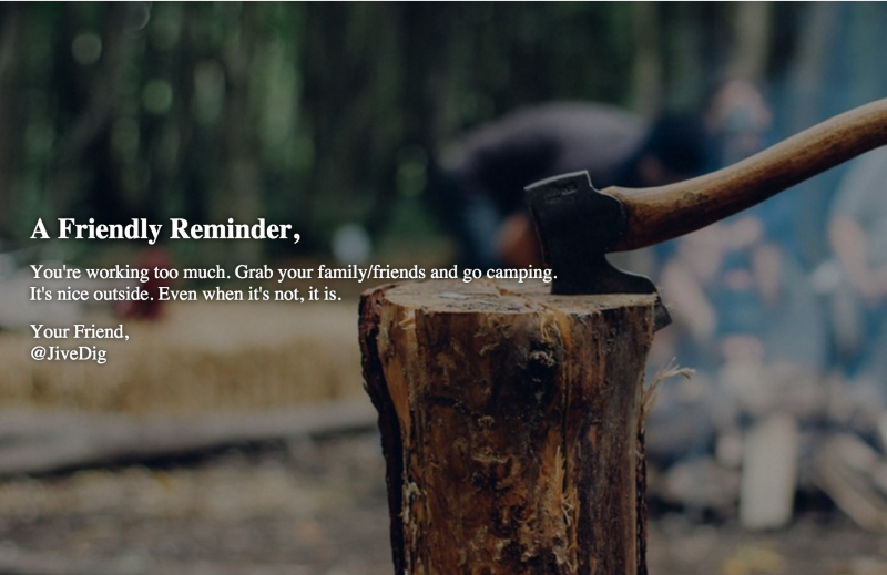
Here’s the scenario. You want to use an image as the background of a container, and you want to maintain that images’ aspect ratio. For an extra bonus, you want to have some text (HTML) on top of the image. There are a few ways you may go about doing this, but all that I’ve tried so far seem to have some major pitfalls. As a starting point, there is a post on Golden Apple Web Design that I keep referring back to. It actually got me 90% of the way there.
Adding content (HTML) inside the container, which is over the image, proved to be tricky. This is especially tricky when trying to make this all responsive.
The first thing we need to do is make the background image cover the entire container element. This is simple with:
background-size: cover;
If you don’t know about that trick, you need to learn it. Read up on the CSS background-size property.
We also need to make the container’s position relative, because later we will be making the content absolute positioned, so we want it to stay within the container.
Do some math
Next, we need to percentage based bottom padding to the container. The percentage used is a 2 step math equation. This adds padding (height) to the wrapping container at a percentage of the container’s width. Thus, preserving the images aspect ratio.
The equation:
B / (A / 100) = C%
So for 16:9 (where 16 is A and 9 is B):
9 / .16 = 56.25 (%)
Full breakdown of getting the percentage:
If the aspect ratio we want to keep is 4:3 (4 by 3):
- 4 divided by 100 = 0.04
- 3 divided by 0.04 = 75
- Therefore, padding-bottom is 75%
Don’t do any math
Some friends in the GenesisWP Slack group said I should make it easier to copy and paste, and not require lazy people to do their own math. 🙂
So, here you go:
.apsect-ratio-16x9 {

	padding-bottom: 56.25%;

}

.apsect-ratio-6x4 {

	padding-bottom: 66.6666667%;

}

.apsect-ratio-5x3 {

	padding-bottom: 60%;

}

.apsect-ratio-4x3 {

	padding-bottom: 75%;

}

.apsect-ratio-5x2 {

	padding-bottom: 40%;

}

.apsect-ratio-3x2 {

	padding-bottom: 66.6666667%;

}

.apsect-ratio-3x1 {

	padding-bottom: 33.3333333%;

}

.apsect-ratio-2x1 {

	padding-bottom: 50%;

}
Boom, done. Your container will now display the background-image with the correct aspect ration.
Position the content
Now that our container/image is dealt with, we need to get our content in the right position. We simply absolute position the content and set the top/right/bottom/left positioning to 0. This forces the entire container to fill up the parent.
.my-content {

     position: absolute;

     top: 0; bottom: 0; left: 30px; right: 30px;

}
Center the content vertically
Enter flexbox
This is my go-to method now. If you don’t like it, or you care about older IE, skip this for a kinda/somewhat/pretty decent alternative.
Declare the content as a flexbox element, then make it a column, then center that column’s content. Sounds complicated, and as of now the code is a bit ugly, but it works. And it’s beautiful.
.my-content {

     position: absolute;

     top: 0; bottom: 0; left: 30px; right: 30px;

     display: -webkit-box;

     display: -moz-box;

     display: -ms-flexbox;

     display: -moz-flex;

     display: -webkit-flex;

     display: flex;

     -webkit-flex-direction: column;

     -ms-flex-direction: column;

     flex-direction: column;

     -webkit-justify-content: center;

     justify-content: center;

}
Alternate Method (non-flexbox)
If for some reason you haven’t jumped on the flexbox wagon, you can use CSS transform to center vertically. It’s not as precise with what we’re trying to achieve, since (I think) the container’s bottom padding skews the totals. Nonetheless, it’s not too bad. Just change the top from 0 to 50%, and transform/translate by 50%.
.my-content {

     position: absolute;

     top: 50%; bottom: 0; left: 30px; right: 30px;

     transform: translateY(-50%);

}
Current Limitations
The only thing you really need to worry about here is the minimum vertical height of your content. At some point (on smaller browsers), your content may start to wrap and need more vertical space than your nice aspect ratio image will allow.
At this point I use a breakpoint to get rid of the bottom padding, position the content back to relative, remove the specific positioning, and add some padding. From this breakpoint on, we lose our aspect ratio. A little trick to ease the pain is to set your background-position to where you want to keep the focus of the image.
If the main focal point of the image is in the center, just use:
background-position: center;
If it’s the vertical center but on the right horizontally:
background-position: center right;
Play around with background-position if you haven’t before. It’s really helps when you need it.
I found myself needing to implement something similar to this on my last few projects, so I wanted to write a post I can refer back to for the next time I needed it. I hope you learn something along the way too.
Do you have any other tricks to accomplish something similar? Let me know!
See the Pen zrJvpg by Mike Hemberger (@JiveDig) on CodePen.