Updated: March 15, 2019 to use Flexbox instead of float 🙌
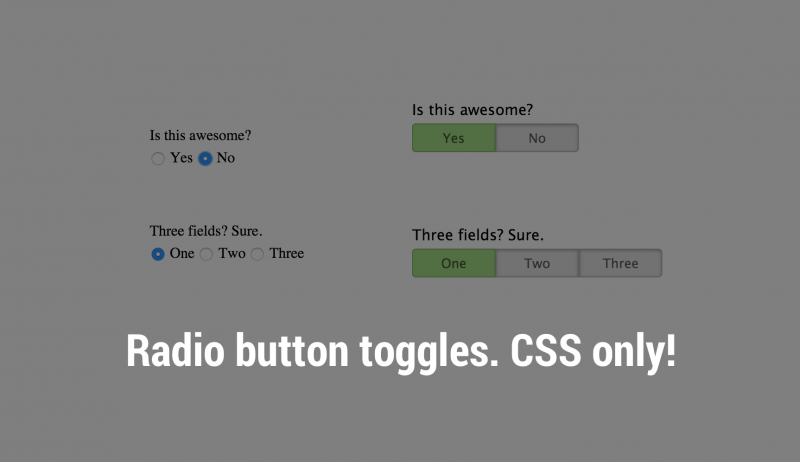
Form inputs are annoying, let’s face it. There is a ton of data showing the more fields you have in a form, the higher the bounce rate of that form. I decided to play with radio buttons and try make them more like simple toggle buttons. After a bit of playing, I got it working in a clean, easy to use style. This makes your form very clear and fast to fill out for your user. Win.
Let’s see it in action
You can play with the CodePen below to see/feel it actually working.
See the Pen Radio button toggle switch by Mike Hemberger (@JiveDig) on CodePen.
Some key points to note:
- The regular radio input is hidden with
“appearance: none;”“display:none;”screen reader text CSS taken from Genesis. - The input label actually becomes the pseudo-buttons
Other then that, it’s pretty straightforward. Give it a try and let me know what you think in the comments!
Really slick–much more fun than the radio buttons! Nicely done!
Woot! Thanks Robin.
Very nicely done, Mike. Great idea and elegant execution of it.
Thanks Trisha!
i think so hard, but very easy.. Thanks Jive…
Thanks Fisya. I thought the same thing. Turned out to be less code than anticipated. Very helpful for some forms with toggle buttons make more sense.
How do i go with this when I have multiple questions that I want to use this code on the same page
Hey Alexander, just use the same CSS classes to target all the radio buttons.
for some reason I have it that if I have 2 different fiends in the same form, when I check it the second one – the first one is being targeted
Does anybody know how to fix my problem?
I got it! I need to give every one of them a efferent ID FOR & NAME .. Thanks for this awesome design idea!!
How do I animate the toggle so it slides right and left when switching instead of fading in and out?
That would be really cool. There may be a CSS transition method, but it’s probably easiest to use a little jQuery. That’s beyond this tutorial/snippet, but let me know if you get something working!
Awesome dude
Thanks Sandeep.
thanks for your help…it’s so useful…
Glad you liked it!
How do you make it so you can tab on the toggle buttons. It looks good but doesnt seem accesible for keyboard only users. I would really like to use it but as long as it is accessible.
I would really like to know the answer to that too.
Great, I will be using this in lots of places.
Thanks a lot. You really knocked this out of the park. This is a really great solution for gravity form developers who want to make slicker forms. It’s helped me a lot.
@Damjan – I’m struggling to implement this in Gravity Forms. I think I’m very close, but I’m definitely missing something. Any chance you can share how you did it, or even share the final code snippets? I’ll buy you an expensive frothy coffee or something…
Did you get this to work with gravity forms ?
I got it to work by making some minor adjustments and turning off the default css provided by gravity forms. Not sure how garbled my css will get posting in a comment, but here it goes. I also added “switch-field gf_list_inline” to my field’s css class list.
/* radio as switch button */
.switch-field .gfield_radio {
display: flex;
margin-bottom: 36px;
overflow: hidden;
}
.switch-field .gfield_radio input {
position: absolute !important;
clip: rect(0, 0, 0, 0);
height: 1px;
width: 1px;
border: 0;
overflow: hidden;
}
.switch-field .gfield_radio label {
background-color: #e4e4e4;
color: rgba(0, 0, 0, 0.6);
font-size: 14px;
line-height: 1;
text-align: center;
padding: 4px 16px;
margin-right: -7px;
border: 1px solid rgba(0, 0, 0, 0.2);
box-shadow: inset 0 1px 3px rgba(0, 0, 0, 0.3), 0 1px rgba(255, 255, 255, 0.1);
transition: all 0.1s ease-in-out;
}
.switch-field .gfield_radio label:hover {
cursor: pointer;
}
.switch-field .gfield_radio input:checked + label {
background-color: #a5dc86;
box-shadow: none;
}
.switch-field .gfield_radio > div:first-of-type label {
border-radius: 4px 0 0 4px;
}
.switch-field .gfield_radio > div:last-of-type label {
border-radius: 0 4px 4px 0;
}
Its greatly working. Thank you..
Great! Thanks!
It won’t change the checked attribute when input changed
Good catch. I’ve since started using the screen-reader-text CSS from Genesis to hide the element but keep it available. I’ve updated the post, this should work now for :checked.
JiveDig, great idea. Ellegant, simple and clean. But (always a but) what you think of change background colors? Example: Yes (green), No (red)? Excuse my bad english
No prob. You can target a specific button by
.switch-field label[for=switch_right] {
background-color: red;
}
problem solved! thanks 🙂
Where do you add this code?
You probably wouldn’t use this code as-is. You would modify it to fit the situation or the form HTML that you are using.
Oh! Thanks. I will mod this to fit my issues, but clearly this is a sweet idea. Thank you.
No prob 🙂
Awesome bro!
Thanks!
Wicked man! 🙂
Great style to those buttons. Don’t use xhtml closers () with html5, use html5 ones! () , thanks!
Thanks, but what do you mean closers?
It never updates the checked value. how are you supposed to get the value back from this when the form submits?
This is just CSS, the form submitting is part of your HTML. We’re using this in a bunch of places without issue. Can you confirm the radio buttons submit properly without any custom CSS?
great!!!
better than bootstrap button component
Hi Mike,
I really love this, and I’m implementing it on my site (thanks). One thing I found is that on iPhone Safari, there’s a flicker when you move between options. I found that adding the following to .switch-field label removed the annoying flicker, making it smooth:
-webkit-tap-highlight-color: transparent;
Thought I’d let you know incase you want to include it.
Thanks again
Alastair
Wow cool! I’ll have to test on mobile. TY.
awesome!, thanks